

Good (Sitecore) developers always want to ease usage of solutions / implementations for their clients, customers or generally end users. This can be done by improving UI of user interfaces or using understandable labels for better orientation. Latter will be described in this blog post and I will show you how to add labels to placeholders / containers if you are using Sitecore SXA.
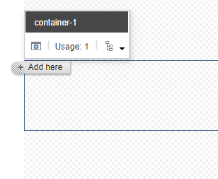
Normally, you would see something like this, as names of placeholders are dynamically generated:
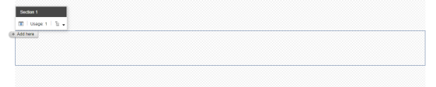
Outcome of below instructions will be custom label / name of container which is more understandable for Content Editors like this:
Solution
Below instructions are valid for Container or Splitter (Columns) or Splitter (Rows) components that are accessible from Page Structure section of SXA Toolbox when they are added either to your Page or Partial Design.
I will use Container component for simplicity.
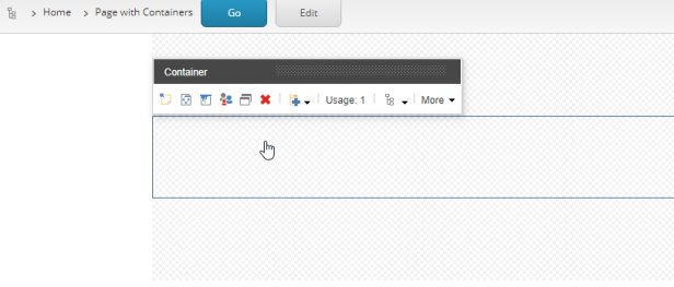
When you add Container component you will see something like this:
If you click inside you can see placeholder which is not labeled nicely:
Now let’s take a look how to “improve” this by creating Placeholder Settings for this placeholder.
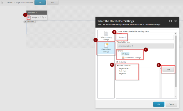
As depicted on below screenshot, click on the Edit button (1). In wizard to “Select the Placeholder Settings”, click Create New Settings (2), specify custom name (3) and choose where you would like to create these settings (4). If you choose Data, Placeholder Settings will be created locally under Data item under current item. If you choose Placeholder Settings, it will be created under current site. Specify Allowed controls(renderings) if you wish (6) by hitting Editbutton (5). When you want to limit components that are allowed in that Container, this is the way to go.
And voila! All working just fine and as expected:
I have used SXA 1.8 installed on top of Sitecore 9.1 to create these instructions.
SXA all the things!
 straight to the core
Was looking for an easy way to get this done in SXA using Partials. Great post!
LikeLike